Toni, what I have done in the past is start with a "standard" font and then tweek it in Windows Publisher, and then Paint.
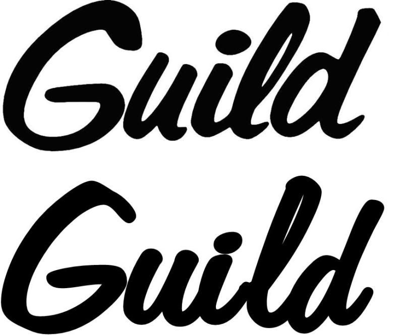
Here is the Guild "Script Logo;
The top logo is the real Guild logo. The bottom is "Freehand 575 BT" font. The "G" is seperate from the "uild" because it has to be slightly larger. In the Publisher Word Art you can adjust the length of the font as well as the lean or angle. What I do is change the font to a light color, lay it on top of the real logo and match it as well as I can. Then I move it off and change the color back to black.
If you then take the font into paint you can match it even better.
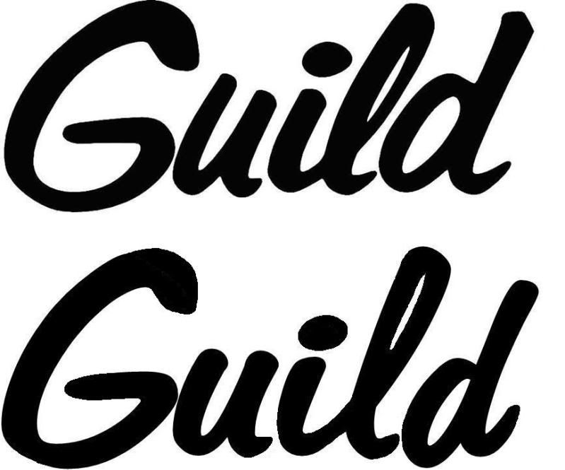
Here's my example of the "Modern" logo;
Once again the top logo is the real Guild logo. The bottom is "Diner" font.
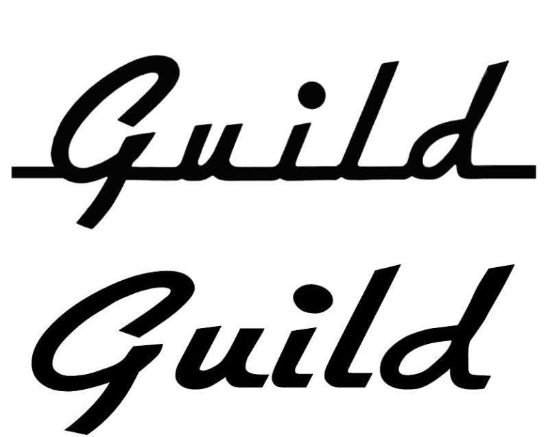
Then, after once again seperating the "G" and then taking it into paint to fill in the bottom line and making the "period" rounder, you can match it pretty close like this;
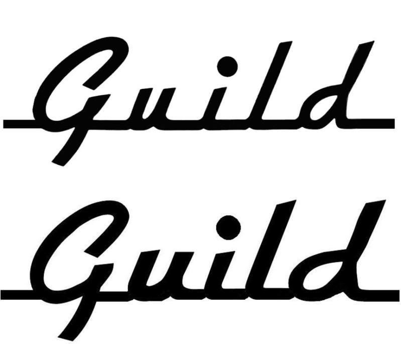
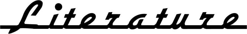
I did this one for my Guild literature book;
So the short answer is that as far as I know there is no "Guild" font but the closest I have found is "Freehand 575 BT".